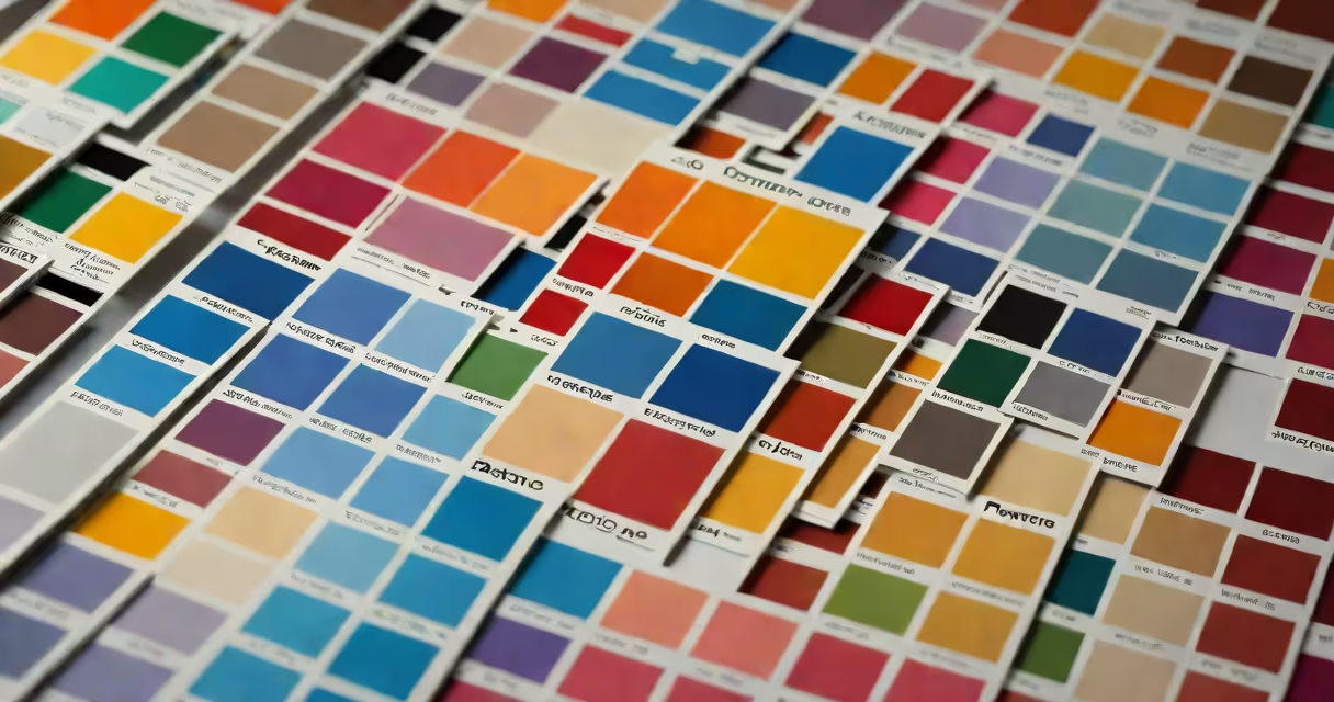
Pantone colors for Illustrator are standardized color swatches from the Pantone Matching System (PMS), used to ensure consistent, accurate color reproduction across print and digital media. These colors are predefined in Pantone's proprietary system and imported into Adobe Illustrator via the Swatches panel.
Designers use Pantone colors for Illustrator to match specific brand hues, especially when working on logos, packaging, or marketing materials where color accuracy is critical. Unlike RGB or CMYK values, which vary by device, Pantone colors represent physical ink formulations, making them ideal for professional print production.
The Pantone Color Institute maintains over 2,000 official colors, each assigned a unique identifier (e.g., PANTONE 19-4006 TCX). When applied in Illustrator, these colors appear as solid, named swatches that remain consistent regardless of screen calibration or output method.
When you apply a Pantone color in Illustrator, you're selecting a specific ink formulation rather than mixing RGB or CMYK values. This helps the printed result matches the intended shade exactly, even if the monitor displays it slightly differently.
To use Pantone colors in Illustrator, open the Swatches panel (Window > Swatches). Click the flyout menu and choose Open Swatch Library > Color Books. Select a Pantone book-such as Pantone Solid Coated or Pantone Fashion + Home-to load the full set of available colors. You can then drag any swatch onto your artwork.
Each Pantone color appears in the Swatches panel with its name and number. For example, "PANTONE 18-3224 TCX" indicates a warm red used in corporate branding. The color remains locked to its physical ink standard unless manually converted to another model.
Pantone offers several color systems tailored to different industries and applications. The most common types used in Illustrator are:
| Type | Best For | Color Model | Use Case Example |
|---|---|---|---|
| Pantone Solid Coated | Printed materials on glossy paper | Spot color (ink) | Brochures, business cards, packaging |
| Pantone Solid Uncoated | Printed materials on matte or textured paper | Spot color (ink) | Posters, stationery, flyers |
| Pantone Fashion + Home | Fashion textiles, home decor | Spot color (dye/ink) | Swatches for fabric patterns, interior design |
| Pantone Color Bridge | Matching print to digital screens | CMYK + Pantone dual mapping | Web graphics that need print consistency |
For example, a designer creating a luxury perfume box might select PANTONE 19-4006 TCX (a deep burgundy) from the Solid Coated book. This color will print consistently across thousands of units because it's based on a physical ink recipe, not a screen-dependent RGB value.
Many users assume that Pantone colors can be perfectly reproduced on screens. This is incorrect. A Pantone color displayed on a monitor is only an approximation. The actual ink will look different under natural light or on coated paper.
Another frequent error is treating Pantone colors as interchangeable with CMYK. While you can convert a Pantone color to CMYK in Illustrator, the result often lacks vibrancy and may not match the original. According to the Pantone website, up to 70% of Pantone colors cannot be accurately duplicated in CMYK without noticeable shifts in hue and saturation.
A lesser-known fact: Pantone colors are not universal. The same PANTONE number can appear slightly different depending on the paper stock or ink type used in printing. A color on uncoated paper may look duller than on coated stock. Always request a physical proof when finalizing a project.
I once designed a campaign for a nonprofit using PANTONE 18-3224 TCX (a rich maroon) for all branding elements. I loaded the Solid Coated book into Illustrator, selected the swatch, and applied it to the logo, posters, and merchandise. The client approved the digital mockups, but during the print run, the vendor reported that the color was too dark.
After checking the Pantone Color Guide, I realized the printer was using a different ink batch. I requested a physical proof using the exact Pantone ink specified in the PANTONE Color Finder database. The corrected version matched the original design precisely. This experience taught me that even standardized colors require verification in real-world conditions.
Using Pantone colors for Illustrator correctly requires attention to detail. Always verify the Pantone book version and confirm the output method. For digital-only projects, consider using Pantone's Color Bridge system, which maps Pantone colors to both CMYK and RGB equivalents for better cross-media consistency.